
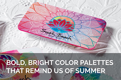
Bold, Bright Color Palettes that Remind Us of Summer
Category: :: 01/07/2020
Certain visual elements will always make it feel like summer. A meadow full of daisies in bloom, cotton candy sunsets, an umbrella perched up on a sizzling sand dune — this is the look and feel of summer. What can designers do to connect a brand with this good vibe?
Your typical branding colors for a business card or logo will likely include darker tones. Midnight blue, grey, and red — not especially summer-y colors, and an odd pairing for a company that prioritizes fun in the sun. On the other hand, fun, bold colors like yellow, hot pink, and teal are a sure sign that warmer days have arrived.
A number of companies who are defined by the summer experience, including Baskin Robins and Raging Waters, make a summery color palette their year-round branded look. What are some of the colors they rely on to create that effect?
Your favorite summer colors

Hot Pink
Hot pink is the color of Carribean sunsets. It’s Miami, it’s fluttering chiffon beach shawls, it’s… summer. Companies that use hot pink in their branding are making a standout choice, and one that’s not necessarily right for every industry. However, when it fits, few colors make the same kind of impact.

Yellows
Yellow tones are the summer sunshine distilled into a hue. The lightness and the brightness of the color comes to us in the form of sunlight, flower petals, and more. Color psychologists argue that yellow is vibrant and attention grabbing, though caution that it can also be perceived as a warning when used too intensely.

Teal
Teal is a highly emotional color that connects to memory. From hummingbird wings to scuba adventures, it’s a color that is all or nothing summertime vibes. Teal is considered a revitalizing and rejuvenating color by many, which makes it a great choice for rebranding.
Companies that connect with a summertime vibe

Baskin Robbins
Few things say summer quite like an ice cream cone. Ice cream shops draw heavily from the summertime feel in their branding, and few do it quite like Baskin Robbins. Founded in 1945 by Burt Baskin and Irv Robbin, B&R is now the world’s largest ice cream chain. Their branding is iconic in the sweets industry, combining nods to a classic look with an exciting new flavor.
To give the feeling that summer is a year round event, B&R uses a lovely brand color palette that includes hot pink, coral, and soft shades of blue. This delightfully coastal combination brings you right to the beach in an instant.

Raging Waters
Raging Waters is a California-based water park with locations in LA, Sacramento, and San Jose. They offer numerous ways to cool down at their theme parks, from the excitement of the family-friendly wave pool to a seven story freefall on the Drop Out waterslide.
The branding at Raging Waters is clearly inspired by the pool, with rich teal and blue tones paired with orange to accent. This evocative color duo seems to bring the heat of the summer in contact with the coolness of the water. The result? Branding that makes a splash.

Jamba Juice
Our favorite summery paints, fabrics, and inks weren’t synthesized in a lab from nothing — they all have a connection with the colors of the natural world, especially in the form of fruits and veggies.
That’s why it’s no surprise that the popular juice shop chain Jamba Juice uses a fun collection of colors in their branding, from a light and summery yellow to green, orange, and red.