
Best Colors For Business Cards: What Works? – SilkCards
Category: :: 11/06/2023
Did you know that the color of your business card can have a significant impact on how potential clients perceive your brand? Colors have underlying meanings and associations that can influence emotions, thoughts, and behavior.
In this post, we will delve into the importance of color in business cards and how it can convey your brand personality. We will also explore basic concepts of color theory and how it applies to business cards. Additionally, we will discuss different colors for business cards and what they symbolize, such as the professional appeal of black and white or the trust-inducing qualities of blue and green. Lastly, we will provide design elements to consider when creating your business card, such as incorporating your brand logo and ensuring legibility and aesthetics.
By choosing the right color combination for your business card, you can boost your brand’s recognition and create an experience or emotional tether that will be remembered far beyond the handing of the card. It’s not just handing out a necessity, more importantly, it’s handing out pride, confidence, acknowledgment – which achieves the desired EXPERIENCE.
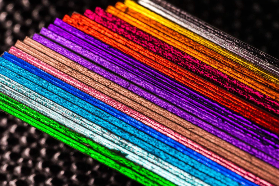
Understanding Color Theory the Significance of Color in Business Cards
A well-designed color scheme not only attracts attention but also makes your card memorable. It’s important to consider the psychology of color when selecting your card’s color palette, as different colors convey different messages about your business.
Colors can even influence how people perceive your business card design. With all this in mind, choosing the best colors for your business card is a crucial decision to make.
Color Theory
Color theory is a fascinating field of study that explores the interaction between colors. By understanding color theory, you can make more informed choices when designing your business cards. It takes into consideration color meanings, color harmony, and color psychology.
The color wheel serves as the foundation of color theory, providing a visual representation of how colors relate to one another:
- Primary colors, such as red, blue, and yellow, cannot be created by mixing other colors and are used to create all other colors.
- Secondary colors, such as orange, green, and purple, are created by mixing two primary colors together.
- Tertiary colors are formed by combining a primary color with a neighboring secondary color on the color wheel.
- Complementary colors, such as red and green, are opposite each other on the color wheel and create a vibrant contrast when used together.
- Analogous colors, such as red, orange, and yellow, are adjacent to each other on the color wheel and create a harmonious effect.
- Triadic colors, such as yellow, blue, and red, are evenly spaced around the color wheel and provide a balanced yet dynamic color scheme.
When choosing colors for business cards, considering these 3 attributes is essential:
- Saturation refers to the intensity or purity of a color, while brightness refers to the lightness or darkness of a color.
- Hue represents the actual color itself, such as red or blue.
- Color temperature plays a role in color theory, with warm colors like red and orange evoking energy and passion, and cool colors like blue and green creating a sense of calmness and tranquility.
These concepts of color theory can guide you in making the best color choices for your business cards, ensuring that they convey the right message.
Exploring Different Colors for Business Cards and Their Meanings
When it comes to business cards, the choice of colors plays a significant role in conveying the right message to your recipients. Black and white business cards are a popular choice as they exude a professional and timeless appeal. On the other hand, red and orange colors can bring energy and excitement to your cards, making them stand out. If you want to instill trust and relaxation in your card recipients, blue and green colors are a great choice.
It’s important to consider color meanings and your target audience when selecting colors for your cards. By using color psychology, you can create business cards that make a strong impression.
Here are some commonly used color associations to consider for your cards:
Gold:
- Gold is widely seen as a mark of status across cultures
- Frequently used as an accent color (font color, border color, etc).
- When used in a metallic foil, a golden glimmer is especially eye-catching
Purple:
- Traditionally connected with royalty and power
- Very bold, commonly used as an accent color so as to not overwhelm
- Soft purple tones, such as lavender, are popular for kid-related businesses and maternity brands
Blue:
- Peaceful, harmonious, and calming associations, related to the sea and sky
- Evokes reliability and relaxation when used in branding
- However, dark blue is often considered a somber color, one that doesn’t excite or vie for attention
Green:
- Closely associated with the natural world
- Popular for sustainable and environmentally-minded brands
- A classic look that’s also popular for iconic industrial companies (think John Deere)
Yellow:
- Associated with happiness, positivity, summertime, and sunshine
- Richer yellow hues are also used as warnings (construction signs, for example)
- More playful and optimistic than most colors, so it’s great for kids
Orange:
- Associated with fun, liveliness, and whimsy
- Attention grabbing, especially in high-visibility color tones
- Great for brands that associate themselves with summer
- Popular for calls to action
Red:
- Associated with excitement, energy, and action
- Captures attention with engaging boldness
- Used in warnings, so can also be perceived as threatening
Black:
- Powerful and serious on its own, black also makes other tones stand out
- Highly sophisticated and elegant with a touch of mystery
- Commonly associated with darkness, so not necessarily the best choice for fun/whimsical brands
Pink:
- One of the most variable (and trendy) color tones
- Soft pink is calming and gentle, whereas hot pink is attention-grabbing
- Commonly associated with more feminine branding, frequently tapped by brands in cosmetics, fashion, and beauty salons
- Also associated with women’s health advocacy
Design Elements to Consider
Consider your target audience and the message you want to convey when designing your business cards:
- Align the choice of font, colors, and layout with your branding and business values to create a visually appealing design.
- Incorporate your logo design, contact information, and branding elements into your business card design for consistency.
- Pay attention to the balance of white space, graphic elements, and information to ensure clarity and readability.
By following these design elements, you can create a great business card that effectively represents your brand.
Incorporating Your Logo
When designing your business cards, it is essential to incorporate your brand logo to reinforce your brand identity:
- Make your logo the focal point of your cards, ensuring it stands out and catches the viewer’s attention.
- Consider using colors in your business card design that complement your logo, creating a cohesive branding message.
- Place your logo strategically, considering the overall design and hierarchy of information on your cards.
Your logo should represent your business, values, and target audience. Incorporating your logo is a great choice for creating visually appealing marketing materials.
Ensuring Legibility & Aesthetics
To ensure legibility and aesthetics on your business cards, it’s important to choose colors, font styles, and font sizes that enhance the readability of your information.
- Make sure there is enough contrast between background colors and text colors for easy reading.
- Opt for clear, professional font size and style that reflects your business tone and personality.
- Enhance the aesthetics of your business cards by incorporating design elements like lines, borders, or graphic accents.
- Regularly review your business card design to maintain visual appeal and ensure it aligns with your branding.
How Does the Right Color Combination Boost Your Brand?
The perfect color combination on your business cards can evoke emotions, create brand recognition, and attract your target audience. Different colors have unique meanings and associations, allowing effective communication of your message.
Understanding color theory and its application to business cards can help you create a design that aligns with your brand values and goals. From the professional appeal of black and white to the energizing effect of red and orange, each color has its own meaning and impact.
It’s important to consider design elements such as incorporating your brand logo and ensuring legibility and aesthetics. By choosing the right color combination, you can enhance your brand image and leave a positive impact on your target audience.